EIKO
Energy Storage Systems
Brand Identity & Art Direction
Scope
Brand Identity, Visual System,
Art Direction
Year
2023
Client
Eiko Power (OmnisPower Europe)

Context
EIKO POWER, a subsidiary of OmnisPower Europe, entered the competitive energy storage market, needing to establish credibility with European B2B clients while differentiating from Asian-manufactured competitors.


Solution
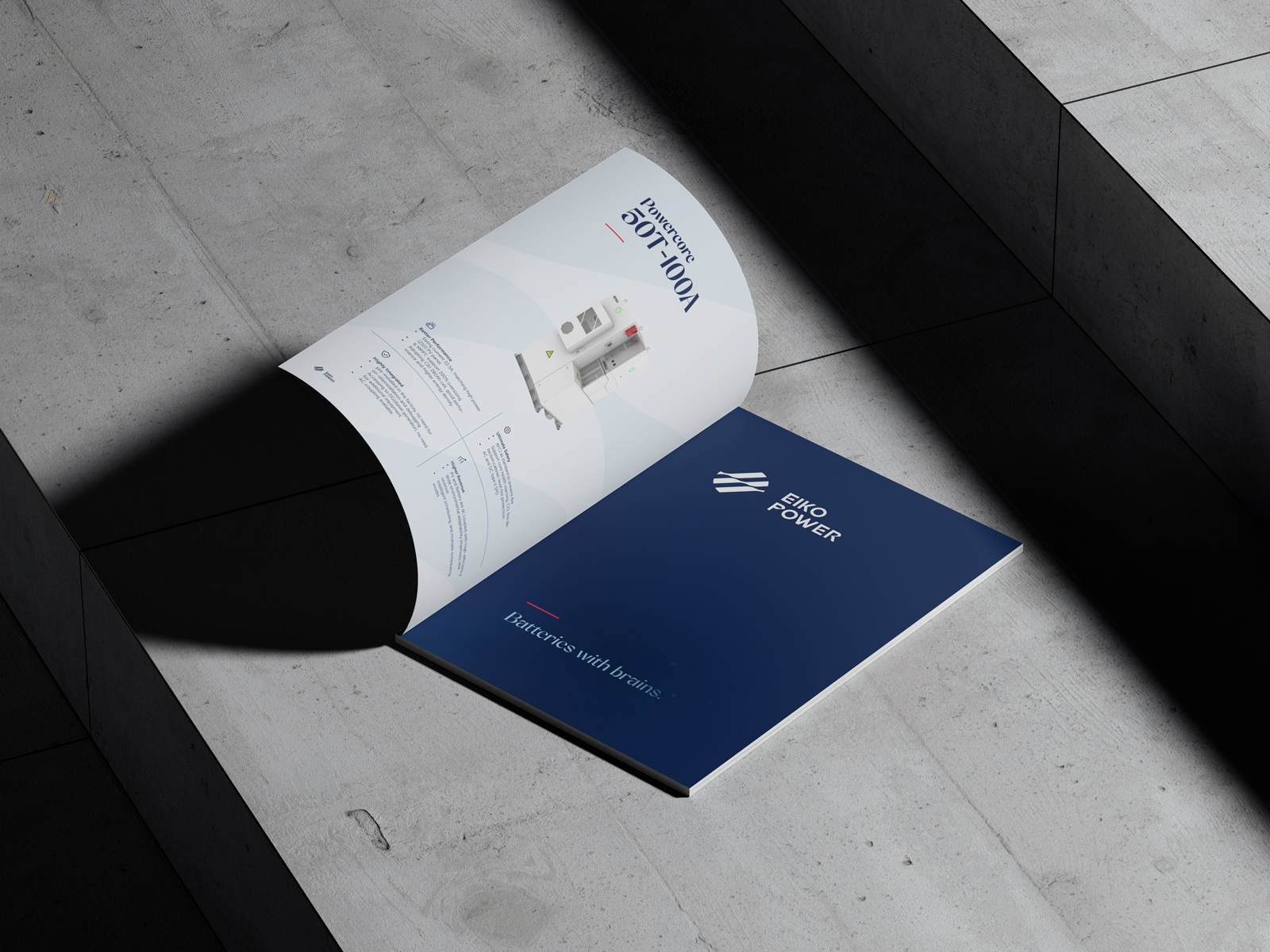
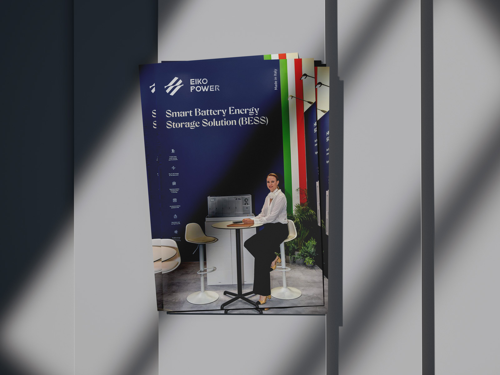
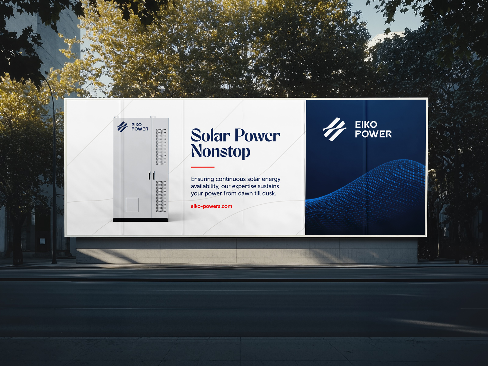
I created a bold, technical identity combining navy (trust, stability) with energetic red accents. The dynamic diagonal logo mark suggests energy flow and forward momentum. Led the complete rollout including digital visuals, event materials, and outdoor advertising for their market launch.